How Luxury Brands Can Use Web Design to Communicate Class
Class isn’t the vague concept it’s often imagined to be. There are intangibles, of course, but it mostly comes down to presentation: something that luxury brands need to get right online.
Top brands need to work to protect their cultural cachet. To keep selling, they need to be viewed as distinct from other brands somehow — superior in various ways. This demands an answer to a big question: what makes a luxury brand seem superior to all the bargain brands out there?
You might say it’s product quality, and sure, that’s often true… but not always. There are plenty of cheap products out there that match or outperform more expensive branded items. Alternatively, you could suggest that it’s a matter of rarity, but plenty of luxury brands have effectively-unlimited stock. Instead, I contend that it’s presentation.
How a brand presents itself determines how it’s perceived. Value — whether of a product, a service, or a brand itself — isn’t governed by objective assessment. Make something look good enough, and people will be willing to pay a lot for it. This is certainly the case with web design, so let’s look at how design elements can be used to make a brand seem classy:
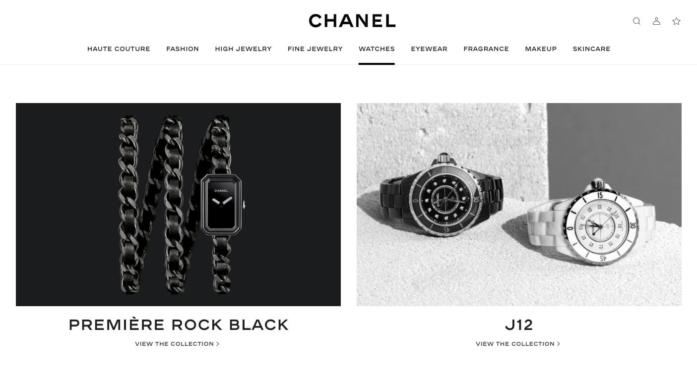
Space everything out to communicate calmness
The average internet user is in quite a hurry, whether because they have pressing matters elsewhere to deal with or are simply aware of the options open to them and don’t want to hang around a mediocre website for 10 minutes just to give it an extra chance to impress them. This leads many companies to feel that they must get their messages out as quickly as possible.
The result of this approach is clumsy content density: everything packed into a tiny space so no one can plausibly miss anything. It’s also tied into a lack of planning for scale. Understanding the importance of mobile design, someone might create a mobile interface but forget to scale it appropriately for larger screens. It comes across as quite panicked.
Imagine a salesperson who rushes through their pitch in a matter of seconds. You’ll assume that they’re used to getting cut off, likely because it isn’t a good pitch. Then imagine a relaxed salesperson who takes their time. Which will you be more drawn to? Great luxury brands know to space everything out to maximum effect, allowing visitors to really take their time — understanding that a lack of pressure makes a brand feel much more compelling.
Use certain tones and clear contrasts
If you visit a lot of luxury brand websites, you’ll notice that they tend to use certain colors: blacks, whites, greys, golds, silvers, and even rich purples, reds, and greens. There are various reasons for this. Blacks and whites contrast very nicely with whatever else you have on the page, and have superlative connotations — black being the darkest you can get, and white being the lightest, just as a luxury brand wants to come across as offering superlative luxury.
Golds, silvers and metallic tones in general allude to wealth. There’s the obvious association with both money (in the form of coins) and metal in general (typically more expensive and difficult to manufacture than plastics, making it indicative of high-quality construction). In addition, they’re typically used with fairly low saturation, making them great for text backdrops.
The major takeaway here is that a reserved approach is best: covering a page in a dazzling neon color would come across as incredibly gaudy and tasteless. Toned-down color schemes with occasional splashes of vibrance (using either rich dark colors or pale pastel colors) look excellent, minimize eye strain, and demonstrate understanding of design principles.
Stick to confident short-form content chunks
When someone is completely confident in the truth and significance of what they have to say, they don’t need to repeat the same points over and over, nor do they need to pad them out. Filling a page with enormous paragraphs just gives the impression that the writer is trying to put out so much text that the reader won’t have the time to think critically about any of it.
A strong luxury brand can get by on succinct and powerful chunks of content. If the strengths of the products aren’t sufficiently compelling to function without supporting structures, then the products don’t really fit in the luxury product category. Think about how brands like Apple describe their products: briefly and boldly. By giving the impression that the products sell themselves, they create a reality in which that’s actually the case.
Of course, there’s an obstacle here that international brands must deal with: content translation. A snappy description in English might take up a huge amount of space in Spanish. It’s easy enough to get an ecommerce back-end that supports many languages — merchants typically choose to sell globally with Shopify Plus, or try Magento Commerce with language packages — but that doesn’t help with the front-end. If a location is worth selling to, it’s worth selling to with high-quality language, and that calls for dedicated translators.
Rely heavily on high-quality visuals
Lastly, while text certainly matters when you’re trying to sell something, the history of advertising tells us that visuals are more impactful. But that’s not all — think about the significance for exclusivity and setting your brand apart. Any company can mimic good copy enough to fool someone who isn’t paying close attention, but it can’t mimic great visuals so easily.
To get the glossy shots (and video clips) that luxury brands often use, it takes a lot of investment. Writing, storyboarding, expensive cameras, additional production equipment, direction, editing… the costs add up very quickly (even when using freelancers) and most brands can’t compete — this is why they rely on stock photos or settle for low-quality shots.
So, if a luxury brand really wants to stand out and exude class, it must ensure that its visuals match the image it wants to project: show every site visitor that it has plenty of resources and spares no expense on any of its endeavors. After all, details matter.
It doesn’t take all that much for a website to come across as classy. It’s all about showing confidence, using visitor time effectively, and polishing both text and images to the point of there being no filler anywhere to be found.

Patrick Foster is a writer and ecommerce expert for Ecommerce Tips. He understands the challenge of catering to users and search engines.
Visit the blog, and check out the latest news on Twitter @myecommercetips.